There is a trend to just go with the crowd. To replicate what has been done before because it was successful or proven to be better at some point in the past. This is fine for some things, like wheels on a bike or a burger menu on a website where anything else would cause frustration. There are economies of scale where products become affordable and easily replicable, and just seem to work straight out of the box. But eventually they’ll lose their appeal when the shiny new thing lands. This seems to happen a fair bit with content. As businesses look to save money by using stock photography and focussing words that appeal to Googles search algorithms, they all become a bit too similar.
It’s not just websites though. There are design trends that appear each year. And because they are ‘of the time’ they get copied and start appearing in every corner. But sometimes company identities become less identifiable or unique. I think design trends are great if you want to appear alongside the new and trendy, but I question if they make you stand out in a crowd, particularly if you’re late to the party. The answer is to modify a trend and make it your own. Or just do something completely different… something that ties in with your brand values and personality.
Not long ago, I was working for on behalf of an agency and I was asked to come up with a concept for an exhibition stand. Now, the easy route would have been to look at what options there were for boomerang or pop-up stands. Maybe there was a new stand template that would make them appear different or catch attention? The brief was fairly open, and no one was vocal about a set budget so I thought I’d push the boundaries and consider making these cringe-worthy backdrops for salespeople more inviting.
It’s where I started… what is the experience for the target audience, the attendees of The Gadget Show exhibition. Being an event attendee you often have a lot to see within a small amount of time, well before your legs get tired anyway. Often you avoid the heavily manned stands with eager representatives trying to lure you in as you can get stuck for longer than you expect. And no one wants to be rude and walk away mid-pitch.
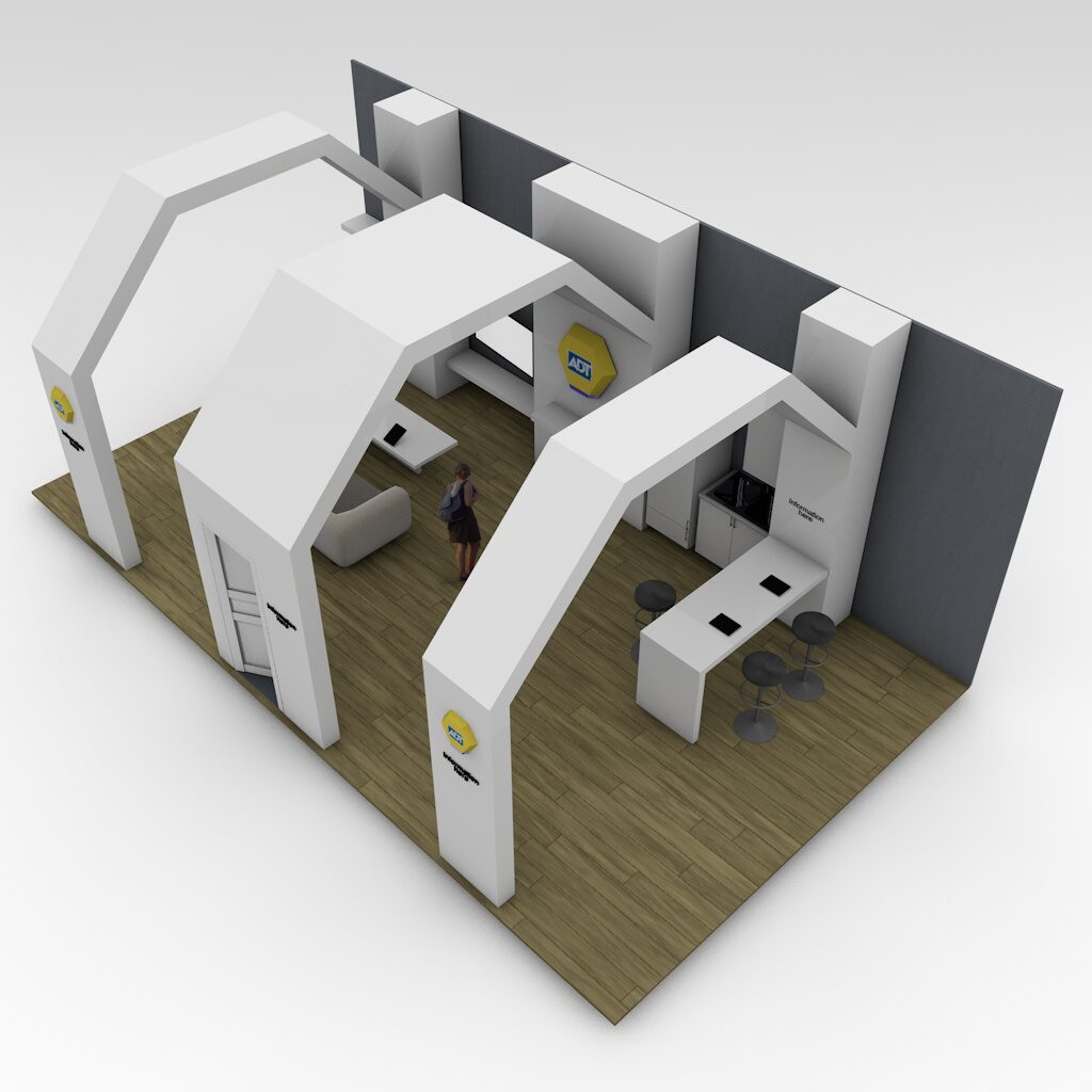
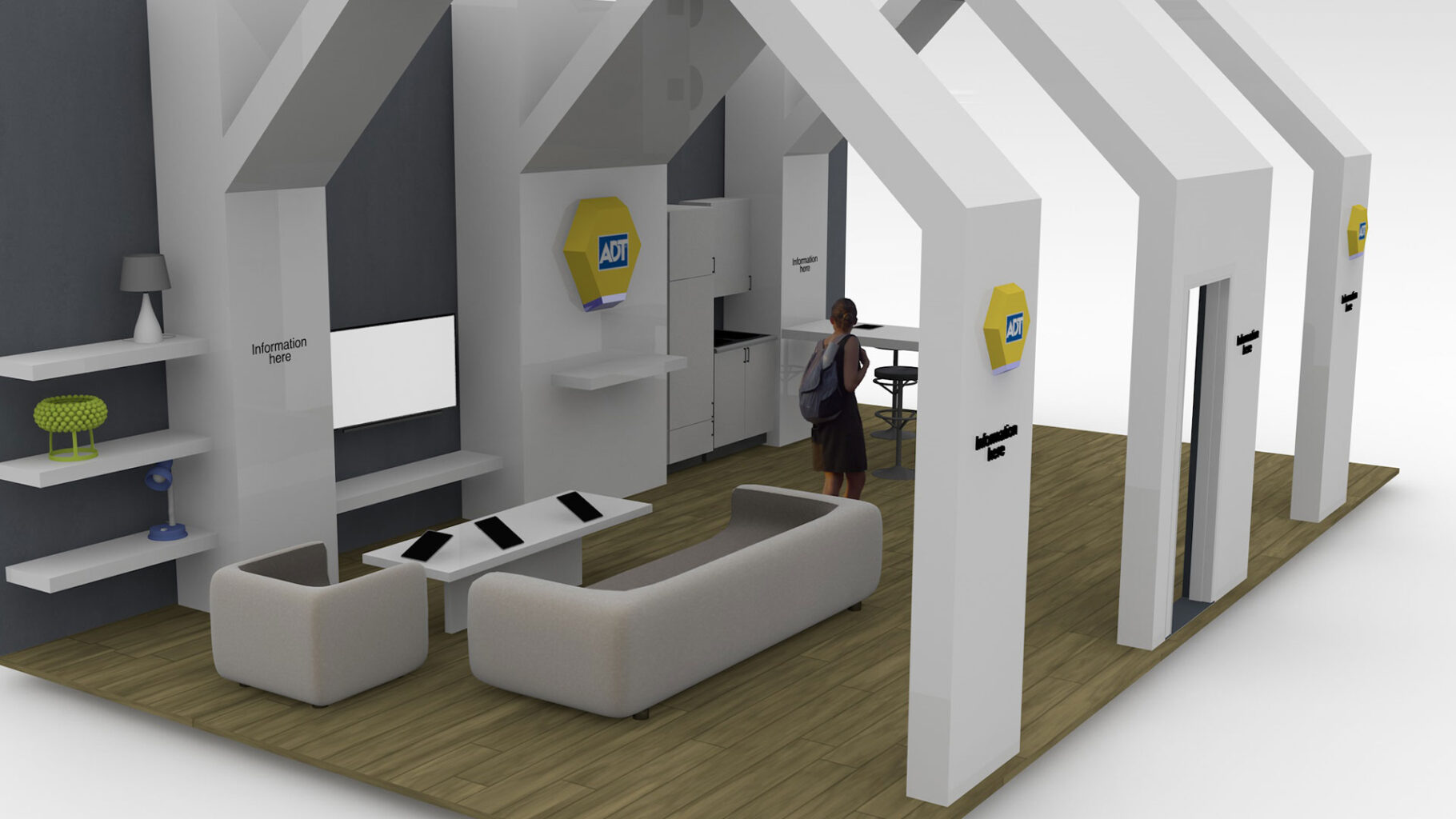
My idea was to keep it open. Users could walk in and around the stand without ever feeling ‘trapped-in’. By designing an open-house shaped stand that was also influenced by the ADT logo’s hexagonal shape, I created walkways and spaces that invited exploration. It was a Smart Home product they were promoting so I built in areas to sit, relax and play on tablets that controlled lights, plugs and alarms. I wanted to create a space that reflected the high tech nature of the product with suggestions of simplicity and easy access.
This concept was developed on by ADT’s own internal team and apparently was a great success at the show, with many attendees popping in for a cuppa.

