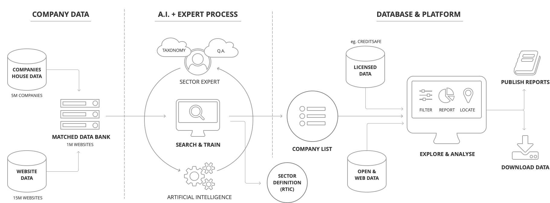
In my career the most challenging UX project I undertook was for The Data City. It was the first time I’d really had the opportunity to design an application that interfaced with A.I. The platform was invented to give users the ability to create training sets for machine learning and provided filtering and re-training to find companies in emerging industries. By avoiding reliance on SIC codes it can present a better view of a UK industry than competitor platforms.
Each time I describe the project I’m aware that it probably isn’t the easiest to comprehend. If I were to sum it up in a nutshell I’d probably say: It’s software that finds companies in an industry better than any other by using Artificial Intelligence and UK website data. But it is so much more than that.
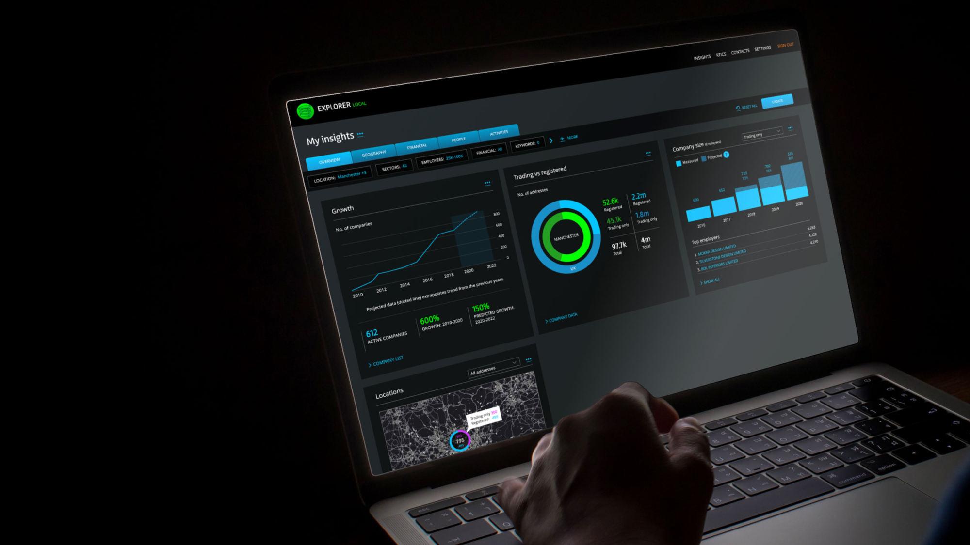
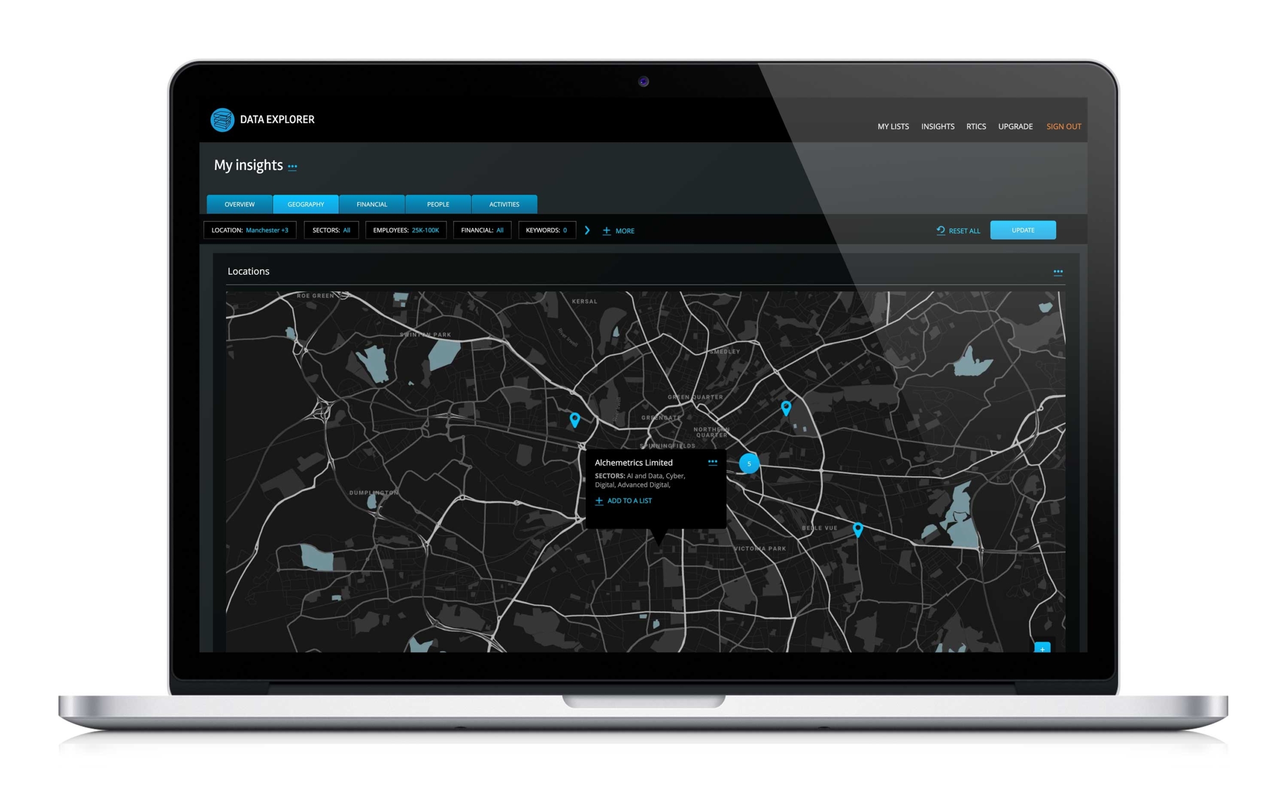
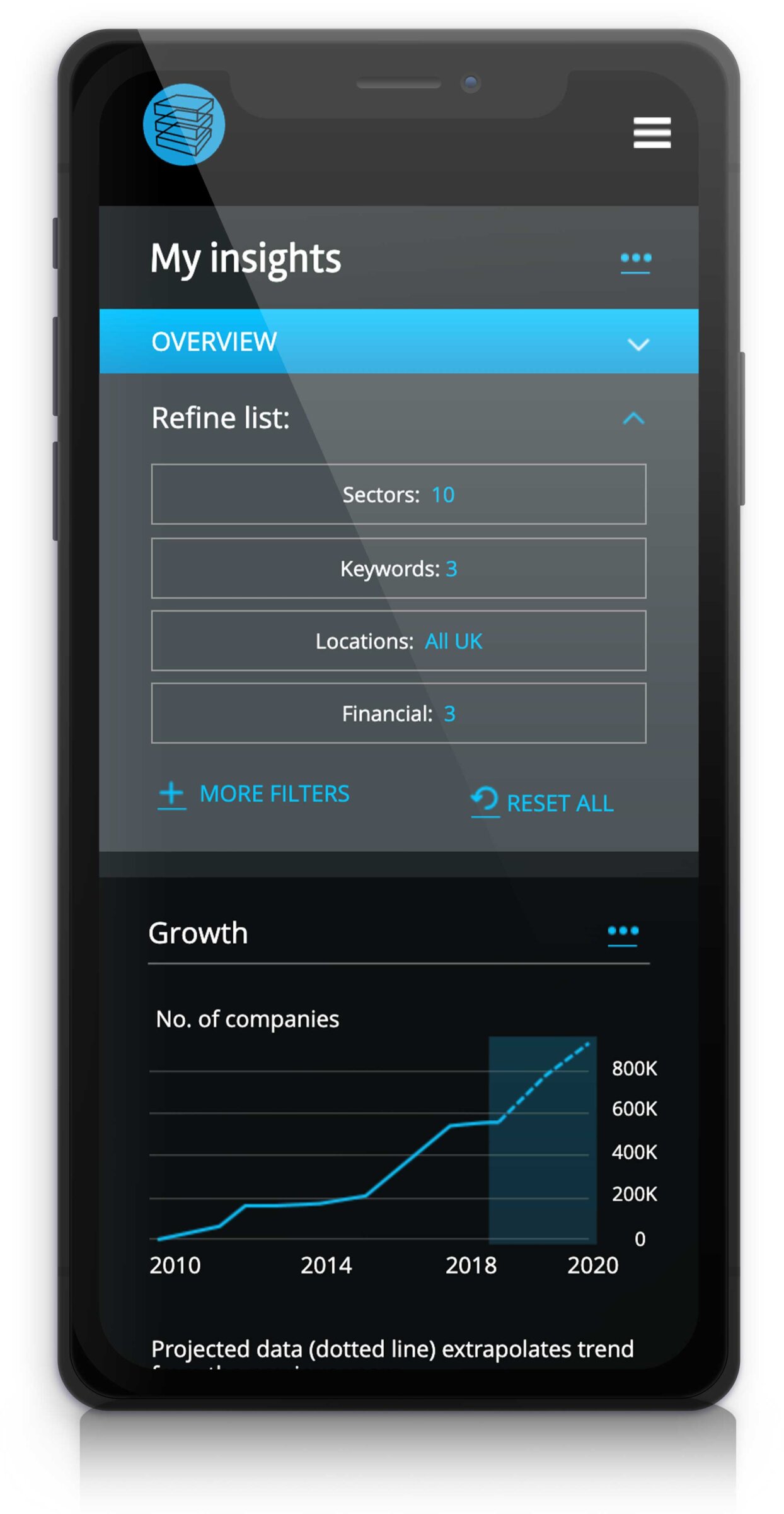
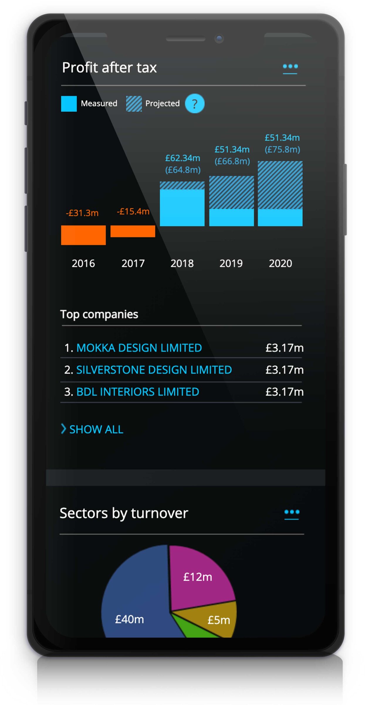
The platform pulled in financial, Companies House and open data to identify the national and local economic performance of each industry. You can create a new industry or even search by business activity. When it was presented to me it was a large, complex beast of a system and I needed to simplify the user experience. At this early stage there was no real interface.
Once I had established The Data City’s brand ambitions as a global platform that solved the problems of poor quality company analysis I wanted to understand what was under the hood. I needed an approach that involved developers and data teams to collaborate and feedback into the design. I took involved the following steps.
Step 1: Profile the audience.
Always a really important stage. Understand who the users are, what they are looking to do and estimate their ability to do the task and achieve their goals. Without prior knowledge of machine learning processes I assumed it would be difficult for many of them to be able to jump straight in. Audiences ranged from economists to data analysts, therefore the platform would need to appeal to a varying range of knowledge and experience. The solution suggested was a step-by-step form that allowed information to be entered in a structured and supportive way so to guide and educate users on how the system worked.
Step 2: Understand the core needs of the audience.
This appeared fairly easy as the platform had been born out of a requirement to locate companies without dependency on SIC codes. That established, I could capture the goals and outputs required by users for it to succeed. After discussions with potential audiences it became obvious that every requirement was slightly different. For instance: company data on specific postcodes was needed so local government bodies could understand the economy within their own defined boundaries. Some wanted national statistics. Some wanted to compare both. Data analysts wanted raw data to plug into their own systems and economists wanted charts and financial headlines provided as part of the tool. The conclusion I reached was that we had to allow the user to define the output.
Step 3: Establish the inputs required by the user to get a successful outcome from the platform.
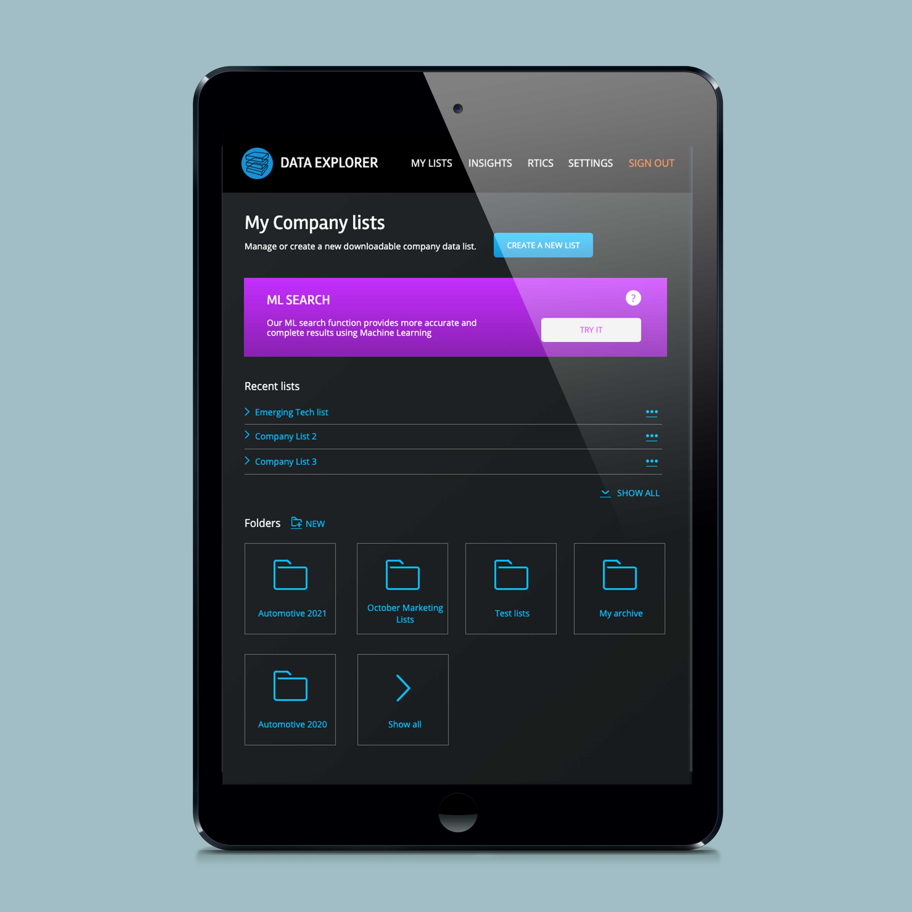
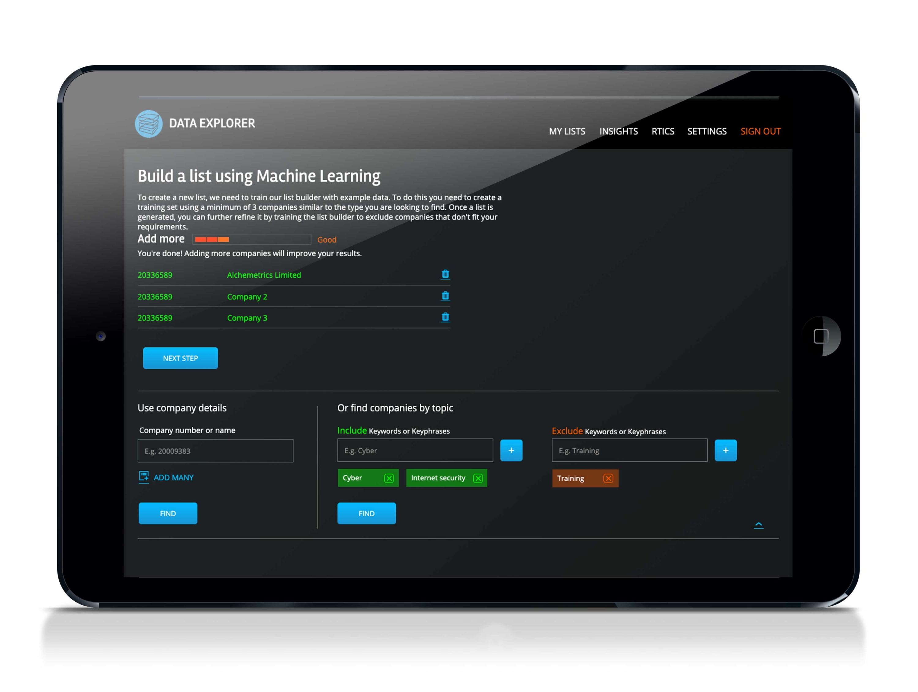
There was an unusual requirement for the users to have a list of example companies before they could use the platform to build a list. In my head that wasn’t ideal and we weren’t going to build a search engine as a pre-curser to using the system as it would be a huge undertaking. We needed to explain to users why this was necessary, what they needed to source and whether the list they had was suitable. So I proposed a pre-list builder with contextual feedback to help users get started. Based on feedback from users we did end up building a preliminary search a few months later which has enabled a more contained experience.
Step 4: Develop a sketch wireframes and user journey flows with support of stakeholders and discuss possibilities of simplifying processes.
As a quick way to collaborate and work through a top level structure for the application, this approach pulled all the decision makers, technology experts and UX professionals together to reduce excessive rework of a design. Many discussions were had around reducing inputs and complex terminology. As an example: I suggested feedback alerts and messages to help users understand problems with entered information and allow them to revisit their inputted information quickly. This saved time and confusion when unusual results were returned by the platform.
Step 5: Design a high-fidelity design prototype to test on users of the system, get feedback and refine.
Building a prototype allowed the company to test and evaluate the solution before committing development time into the project. This stage was all about creating something that felt almost real. Something you could present to potential customers and get their feedback (which we did). Luckily it helped the sales team create a fair bit of pre-launch interest. I used the prototyping application Axure which, in my opinion, is one of the best out there – especially for complex applications. I was relieved when the design was well received amongst our key audience and few amends were required. Phew.
Step 6: Work with developers to build a fully working beta application to address accessibility and usability including device testing.
This final stage was ensure the platform was inclusive for all audiences no matter their impairment, environment or device. Although it was unlikely that users would choose to use a mobile phone for work-based tasks, I’m a believer in web platforms being flexible enough to work across every device. A laptop can have varying screen sizes and tablets come in all forms. If you design something from the ground up to be flexible and responsive, you’ll avoid having to re-engineer it in the future (or create a separate app). You never know where a user will be when they need to build a list of companies in a specific industry! Probably unlikely, but they may want to share a list or answer a question with data on their train journey, from their phone.
Because we tested the design at stages throughout the project we managed to deliver the first beta platform in around 6 months. I won’t say every user found it easy at first due to it’s inherent complex nature, but our core audience of technically-minded data analysts warmed to it very quickly and struggled to find faults with the user interface.
There have been many improvements and iterations of the product and it has matured into a world-first application allowing users to harness A.I. and build datasets with little knowledge of machine learning.
As my first UX project using A.I. based technologies I found the task of designing a UI that didn’t follow typical conventions a challenge. It stretched my experience and knowledge but in doing so felt really inventive.
Services:
- UXD
- Prototyping
- Usability testing